How To Add Helper Classes
This guide is set up to show you different helpers classes you can use to improve the look and feel of the cms content on your site. This section will go over the three different ways you can add a helper class to your content to achieve the look and feel you want.
The three different methods you can use are the following:
- Adding classes to HTML elements.
- Adding classes to Block css inputs.
- Adding classes to Page css inputs.
Throughout this guide, you'll see this table on the right side of your screen:
- HTML Elements
- Blocks
- Pages
- All other Elements
We use this to indicate where the helper class can be added to. For this chart
- If it is green, you can add the helper to that type of input.
- If it is red, you should not add that helper to that type of input, as it may have unpredictible results.
- If it is yellow, you should not add that helper to that type of input, as it has not been tested.
- If it is grey, it means it should have no effect if added to that type of input.
Adding Classes to HTML Elements
When adding classes to html elements, you want to add these helper classes as inline elements, typed in to your HTMl.
A good example of this would be when you are using a button helper, like this to make a black colored button:
blackIn order to specifically make sure the button is the right color, you need to add the helpers in the code, like you see on the right side of the screen.
<a class="button button--black" href="#"> black </a>
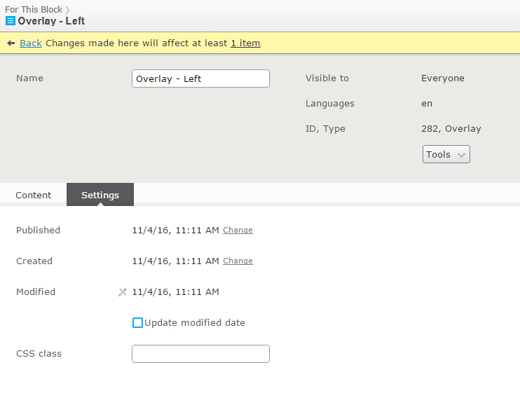
Adding Classes to Block CSS Inputs
When adding classes to the block level, you want to add this to the block's css input field,
which can be found inside the block's all properties menu, either in the settings tab or on the content tab, where a block
may have more than one input for it's content (such as the slider block.)
This css input will look like something like this: as can be seen on an overlay block.
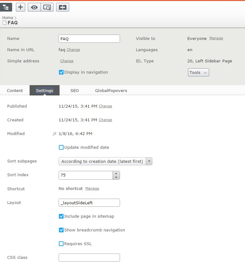
Adding Classes to Page CSS Inputs
Similar to block level inputs, pages also have css input fields, which can be found inside the page's all properties menu, in the settings tab.
This css input will look like something like this: as can be seen on the FAQ page
Typography
Headings
Heading One
Heading Two
Heading Three
Heading Four
Heading Five
Heading Six
<h1>Heading One</h1>
<h2>Heading Two</h1>
<h3>Heading Three</h3>
<h4>Heading Four</h4>
<h5>Heading Five</h5>
<h6>Heading Six</h6>
Paragraphs
Lorem ipsum dolor sit amet, consectetur adipiscing elit. Vestibulum condimentum dui eget orci fringilla, in lobortis mi auctor. Praesent nec mi nec nisl lobortis ultricies eget sit amet justo.
<p>
Lorem ipsum dolor sit amet, consectetur adipiscing elit. Vestibulum condimentum
dui eget orci fringilla, in lobortis mi auctor. Praesent nec mi nec nisl lobortis
ultricies eget sit amet justo.
</p>
Text Links
<a href="#" alt="Sample Link">Sample Text Link</a>
Theme colors
Color table
This section describes the colors used across the Feizy site.
Default Colors
Becker's Colors
Buttons
The following elements are styled to look like buttons:
<button><input type="button"><input type="reset"><input type="submit">- Any other element with
buttonin itsclassattribute (see the examples below).
Buttons of different colors can be created by using the CSS class names from the
color table by adding the color name as --colorname suffix
If no color class is provided, the button will be
orange (with white text).
<a class="button" href="#"> Default </a><a class="button small" href="#"> Small </a><a class="button button--blue" href="#"> Blue </a><a class="button button--teal" href="#"> Teal </a><a class="button button--teal" href="#"> Emerald </a>
Helper classes
Color helper classes
The CSS class name column in the color table indicates the color name that is used in a color helper class. These helper classes can be used to quickly and reliably apply theme colors to different elements on the page, and are used in several different ways.
Text Colors
{color}--text
- HTML Elements
- Blocks
- Pages
To change the text color, use the CSS class {color}-text,
replacing {color} with the CSS class name of a color in the
color table.
black
black
blue
purple
<p class="red--text"> black </p><p class="black--text"> black </p><p class="blue--text"> blue </p><p class="purple--text"> purple </p>
Background Colors
{color}--bg
- HTML Elements
- Blocks
- Pages
To change the background color, use the CSS class {color}-bg,
replacing {color} with the CSS class name of a color in the
color table.
Be aware that, when using darker colors, you may also want to provide a helper class for a lighter text color to keep things legible.
<div class="yellow--bg"> Yellow </div><div class="aqua--bg"> Aqua </div><div class="red--bg"> Red </div>
Text Helper Classes
Alignment
align--{direction}
- HTML Elements
- Blocks
- Pages
To change the text alignment, use the CSS classes align-left,
align-right, align-center, and align-justify.
Left Aligned
Center Aligned
Right Aligned
<p class="align--left"> Left Aligned </p><p class="align--center"> Center Aligned </p><p class="align--right"> Right Aligned </p>
Font sizes fontSize--{#}
- Blocks
- HTML elements
- Pages
To change the font size, use the CSS class fontSize--{size},
replacing {size} with a number from 1 through 10. 1
is the smallest font size, while 10 is the largest. The default
font size is 4.
Size 5
Size 10
<p class="fontSize--5">Size 5</p>
<p class="fontSize--10">Size 10</p>
Font Weights weight--{#}
- Blocks
- HTML elements
- Pages
To change the font weight, use the CSS class weight--{size},
replacing {size} with a number which is a multiple if 100 upto 900. 100
is the lightest font weight, while 900 is the heaviest. The default
font weight is 400 or normal.
Light
Medium
Normal
Semi-Bold
Bold
Black
<p class="weight--100">Light</p>
<p class="weight--300">Medium</p>
<p class="weight--400">Normal</p>
<p class="weight--600">Semi-Bold</p>
<p class="weight--700">Bold</p>
<p class="weight--900">Black</p>
Font Style {fontstyle}
- Blocks
- HTML elements
- Pages
To change the font style, use these CSS classes. The default font-style is normal.
uppercase
LOWERCASE
capitalize
Underline
Italic
<p class="uppercase">uppercase</p>
<p class="lowercase">LOWERCASE</p>
<p class="capitalize">capitalize</p>
<p class="underline">Underline</p>
<p class="italice">Italic</p>
Webfonts
various
- HTML Elements
- Blocks
- Pages
To change the webfont, use the CSS class from the table below that corresponds to the desired font. Group them with other classes such as weights and styles to get best results.
| Webfont name | CSS class |
|---|---|
| WorkSans | worksans |
| ComingSoon | comingsoon |
| Montserrat | montserrat |
Please remember the following with these helper classes:
- Headings have their own default fonts, and a heading's font will not change if you add one of these helper classes to the heading's parent element; you must also add the class to the heading itself.
WorkSans
ComingSoon
Montserrat
<p class="worksans"> WorkSans </p><p class="comingsoon"> ComingSoon </p><p class="montserrat"> Montserrat </p>
Decorations
border__{color}
-
Blocks:
- Adjacent
- Iframe
- Slider
- Standard
- Overlay
- All other block types
-
HTML elements:
-
- Buttons
- All other elements
-
- Pages
Colored Borders
To apply these colored borders to the text of an element, you would use one of the following classes through HTML, the Content CSS Input, or the Block Settings CSS Input.
HTML allows you to be specific to a particular paragraph or image.
Content CSS Input allows you to apply it to all content provided in the Content property.
Block Settings CSS Input allows you to apply it to all content within the entire block.
double--border
-
Blocks:
- Adjacent
- Iframe
- Slider
- Standard
- Overlay
- All other block types
-
HTML elements:
-
- Buttons
- All other elements
-
- Pages
Adds a black outer border and a
grey inner border,
and aligns text to the center (which can be overridden).
Lorem ipsum dolor sit amet, consectetur adipiscing elit. Nam luctus fringilla commodo. Sed ac mauris feugiat, posuere turpis at, lobortis sapien.
Click MeSpacing Helper Classes
These Spacing Helper Classes are meant to give you more precise control over what your content looks like, however they are not responsive. The spacing you add using these helpers will be accross all devices. Because of this, you should avoid using overly large spacing, as it will look bad on mobile devices.
Padding
pad{direction}--{number}
- HTML Elements
- Blocks
- Pages
To change the padding of a block or HTML element, you can use the CSS class pad{direction}--{number}, replacing {direction} with a flag from the direction table below, and replacing {number} with any number divisble by 5 that is under 100. 5, 10, 15... etc...
| Flag | Direction |
|---|---|
| T | Top |
| B | Bottom |
| L | Left |
| R | Right |
| X | Left and Right |
| Y | Top and Bottom |
| {No Flag} | If no flag is added, it will add the value to all sides. |
In the examples below we've add padding to the bottom of the top div. There is 20px in padding added to the top div, and 60px in padding added to the bottom div.
<div class="padB--20 black--bg"> black </div>
<div class="padB--60 black--bg"> black </div>
Margin
mar--{number}
- HTML Elements
- Blocks
- Pages
To change the padding of a block or HTML element, you can use the CSS class pad{direction}--{number}, replacing {direction} with a flag from the direction table below, and replacing {number} with any number divisble by 5 that is under 100. 5, 10, 15... etc...
| Flag | Direction |
|---|---|
| T | Top |
| B | Bottom |
| L | Left |
| R | Right |
| X | Left and Right |
| Y | Top and Bottom |
| {No Flag} | If no flag is added, it will add the value to all sides. |
In the examples below we've add padding to the bottom of the top div. There is 20px in padding added to the top div, and 60px in padding added to the bottom div.
<div class="marB--20 black--bg"> black </div><div class="grey--bg"> grey </div>
<div class="marB--60 black--bg"> black </div><div class="grey--bg"> grey </div>
Page-level helper classes
no-heading
- HTML Elements
- Blocks
- Pages
Hides the automatically-generated <h1> heading.
no-max-width
- HTML Elements
- Blocks
- Pages
Removes the maximum width constraint on the page's content.
articleListPage
- HTML Elements
- Blocks
- Pages
This helper will apply some default styles in regards to how an article's list page will look like.
articlePage
- HTML Elements
- Blocks
- Pages
This helper will apply some default styles in regards to how an article page will look like.
Block Helper Classes
Block Push and Pull
{breakpoint}-push/pull--{amount}
- HTML Elements
- Blocks
- Pages
To change block alignment {breakpoint}-push-{amount},{breakpoint}-pull-{amount} where breakpoint is xs,sm,md,lg,xl and amount is an integer 1-10 1,2,3,4,5,6,7,8,9,10.
So if we wanted to center a block of n width we could do the following. {breakpoint}-push--((12 - n)/2)
<div class="md-6 grid grey-bg"> <div class='md-6 md-push--3 black--bg'>I'm Centered</div> </div><div class="md-6 grid grey--bg"> <div class='md-6 md-push--6 black--bg'>I'm Right Aligned</div> </div>
Block Visibility
{breakpoint}-andUp/{breakpoint}--andDown
- HTML Elements
- Blocks
- Pages
To make a block visible only within a certain breakpoint/screensize/device type apply these classes to the block level.
Note the when we specify lg-andUp it implies this block should be visible for all devices that are on the lg scale and above
Note the when we specify md-andDown it implies this block should be visible for all devices that are on the md scale and below and so on...
If we wanted show block only on desktop add this class to the block level. lg-andUp
If we wanted show block only on devices smaller than a desktop add this class to the block level. lg-andDown
If we wanted show block only on mobile devices, add this class to the block level. md-andDown
These are the {breakpoints} you can use
- sm - small (standard phones)
- md - medium (tablets, large phones)
- lg - large (standard desktops)
- xl - xtra large (large screens)
Custom Helpers
Special Arrow Link arrow--link
This helper class is best used when added to links that need a bit of extra sass.
This helper class can be applied only to an anchor tag a
<a class="arrow--link">uppercase</div>
Sidelines sidelines {color}--text
To create sidelines for headers use this helper.
The sidelines class will add the sidelines in black color unless another text color helper is used, then the sidelines will share the same color as the text.
This helper class can added the following html elementsh1, h2, h3, h4, h5, h6, a, p, span, div
Resource Cafe
Article Header
Article Section
<h1 class="sidelines red--text">Resource Cafe</h1>
<h3 class="sidelines green--text">Article Header</h3>
<h4 class="sidelines blue--text">Article Section</h4>